

Mertra clothing product photos can help narrow down a choice, but only when the right details are visible. Start with front and back views, then look closely at seam lines, panel junctions, graphic placement and any fabric labels shown. A polished photograph may communicate the overall look while leaving important construction details unclear. The aim is to separate what the images actually reveal from what still needs checking in the product description before choosing a piece.
Start with the details that could change your choice
A garment can look convincing in its main photo while leaving details unclear. The front might show the silhouette but hide sleeve construction; a graphic might be visible without revealing its position relative to the hem.
Rather than examining every image with equal attention, focus on details that would genuinely affect your preference. For a hoodie with contrasting lines, their path across the sleeves may be central to the design. For a graphic tee, print placement and proportion deserve more attention. With panelled trousers, the way different sections meet around the pockets or legs may be more informative than the overall colour.
Not every missing detail matters equally. A minor decoration may make little difference, but an unclear back view matters when the design depends on panels continuing around the garment.
Look for a complete front image, a back view and close-ups of the features that distinguish the piece. A worn photograph can add useful context, but it should complement rather than replace unobstructed product views. When comparing pieces across Mertra Clothing, opening the full image galleries side by side is more useful than judging the first thumbnails. You can then see which options offer enough evidence for a fair comparison.
Follow the seams across front and back views
Seams can reveal visible construction that the silhouette conceals. A line from neckline to underarm can indicate a sleeve arrangement; a curved pocket seam or junction may explain a shaped panel.
The question is not simply whether stitching is visible. It is whether the intended seam path can be followed without losing it behind folds, shadows or a cropped image. Locate the clearest join on the front, trace it towards the sides and hem, and compare the result with a back photograph of the same colour variation.
Piping may emphasise a panel boundary without revealing all the underlying construction. Close-ups show stitching and trim placement, not the strength of hidden joins or long-term wear.
The gallery for the Mertra Piping Hoodie and Joggers offers a useful visual example. In the grey hoodie photographs, contrasting piping curves across the front, while the back image shows how the lines appear from the opposite side. Viewing both is more informative than assuming the visible front pattern continues in exactly the same way.
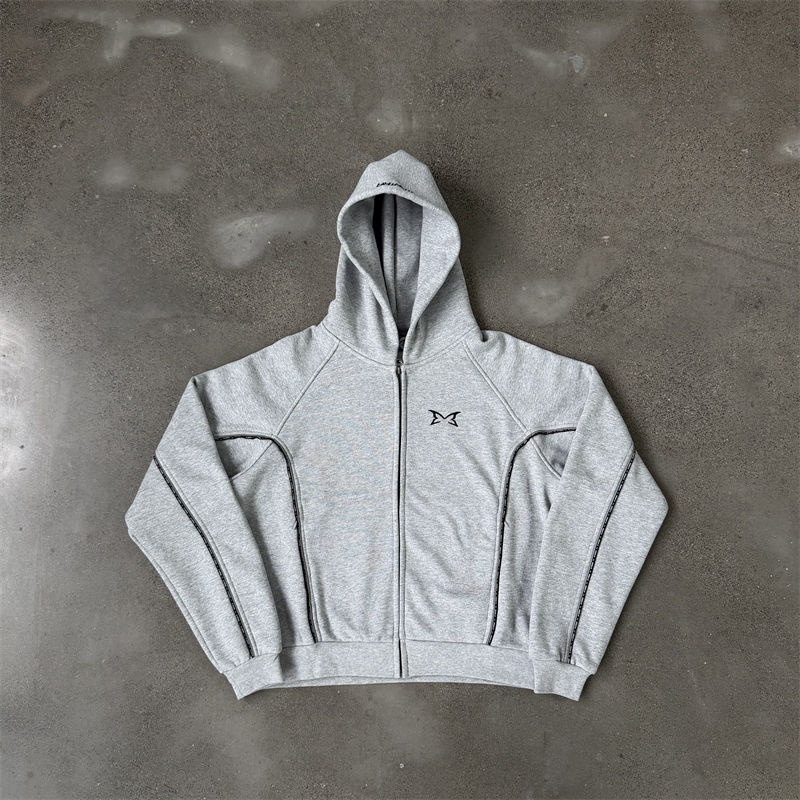
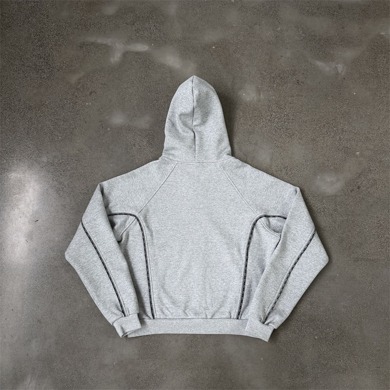
The example demonstrates a useful method, not a quality verdict. If Mertra garment construction is a deciding factor, prioritise images that expose the junctions you care about, and leave any hidden construction or performance questions unresolved until there is better evidence.
Compare panel and graphic placement on the same scale
Two garments may use similar details yet look noticeably different because of where those details sit. A chest graphic positioned close to the neckline creates a different balance from one placed lower on the torso. Side panels can change where the eye follows the leg. Even a narrow contrast line becomes prominent when it crosses a pocket or continues around a sleeve.
Product photography rarely uses identical framing. One garment fills the frame while another appears smaller; a model turns or lifts an arm. A print can therefore look more dominant than it actually is.
Use fixed garment features as reference points instead. For a tee, compare the graphic with the neckline, shoulders and hem. For a zip-up hoodie, use the central zip, pockets and cuffs to understand placement. On trousers, look at where panels or graphics sit relative to the waistband, pocket openings, knees and ankle hems.
A close-up may make a small chest graphic prominent, while a complete view reveals its actual proportion. For panel junctions, an angled photograph may clarify how a contrasting section meets the side. Without it, that arrangement remains uncertain.
Graphic placement should also be kept separate from print quality. A photograph can show approximate position, visible edges and scale. It cannot reliably confirm the printing method, adhesion or resistance to wear. The most useful Mertra photo details are those that can be compared across multiple views at a consistent scale.
Separate visible details from material claims
Fabric appearance is easy to overinterpret. A close-up can reveal texture or knit pattern, and a worn image can show apparent drape. Neither replaces a composition label.
A soft-looking surface does not establish fibre content. Visible thickness does not provide an accurate fabric weight. A smooth or slightly reflective finish cannot by itself verify breathability, water resistance, stretch recovery or any other performance property. Lighting adds another complication: a dark garment may appear warmer, cooler or lighter depending on the environment and image editing.
Fabric labels are different from exterior product images because they can contain readable written information. The Mertra Piping gallery includes a close-up of a composition and care label. This photograph is more specific evidence than guessing from the grey fabric's appearance, but a label shown in one gallery does not automatically establish the composition of every colour variation or both pieces in a set.
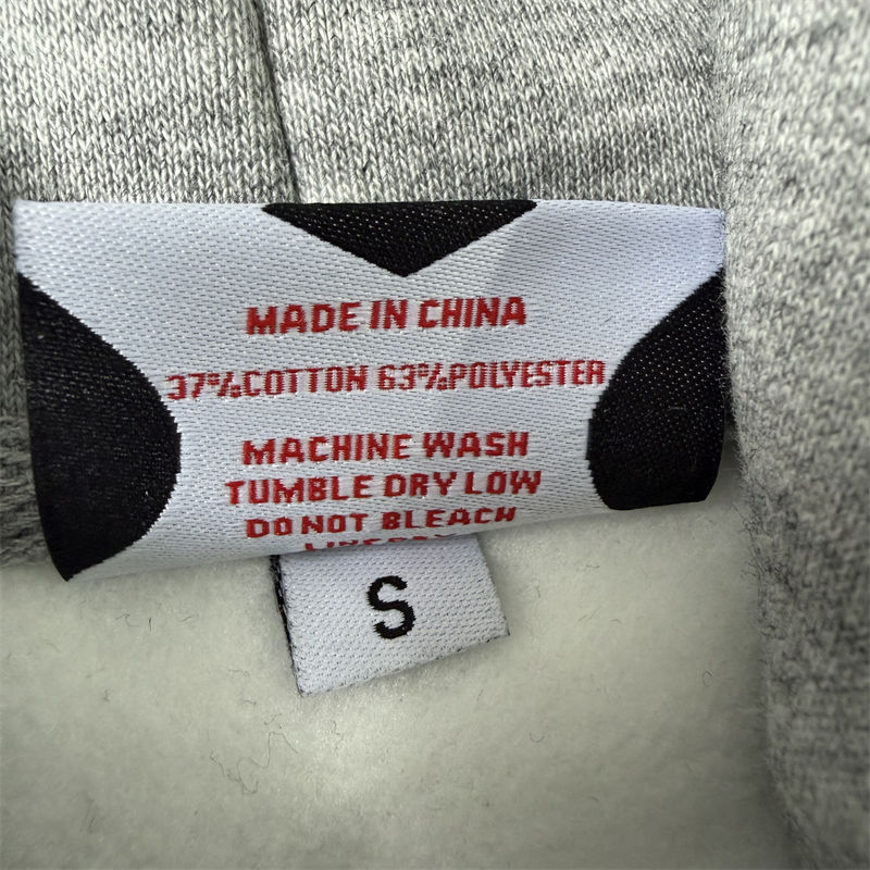 View the fabric label in the product gallery →
Keep the evidence separate: a product photo supports statements about visible colour, shape and detail placement. A readable label or explicit product specification is needed for fibre content. Neither should be turned into an unverified claim about comfort, durability or performance.
When comparing colours, use photographs taken under similar lighting where possible and check the written colour designation as another reference. A neck logo or decorative tag is not the same as a composition label. If the relevant information is absent or hard to read, the responsible next step is to ask for clarification rather than filling the gap with an assumption.
Build a shortlist from photos and verified descriptions
The goal is not the largest gallery but sufficient evidence. Imagine two hoodies: one has unobstructed front and back images plus a sleeve close-up; the other has several lifestyle shots but hides that sleeve throughout.
If the sleeve design matters, the first listing is easier to evaluate. The second is not necessarily a worse garment. Its available images simply leave a question unanswered. That distinction prevents missing information from being mistaken for a visible defect.
Keep pieces whose visible details match your preference, reject those that do not, and set aside uncertain options until a missing view or description could change the decision.
Once the visual shortlist is manageable, compare the written descriptions against the photographed variations. Check whether the colour designation matches the item shown and whether any claims about fabric or construction are specific enough to evaluate. If a detail appears on one colourway, do not assume it is identical across every variation without supporting images or text.
When something important is missing, request the photograph that would resolve the uncertainty: a straight-on back view for a rear panel, a close-up for an ambiguous seam junction, or a readable composition label for fibre content. One targeted image often adds more value than several general outfit shots.
Frequently Asked Questions
Can lighting change the apparent fabric colour?
Yes. Lighting temperature, exposure, shadows and image editing can affect how fabric colour appears. The same garment may look warmer, cooler, lighter or darker between photographs. Compare images made under similar conditions and use the written colour designation as an additional reference. Neither guarantees an exact match to how the garment will look in person.
Can product photos confirm fabric composition?
Not from exterior appearance alone. A readable photograph of a composition label can provide specific fibre information, but confirm that the label belongs to the relevant garment and variation. If the label is absent or illegible, consult a specific written material statement or seek clarification.
Which extra view should I request before choosing?
Ask for the image that answers your most important unanswered question. A straight back view helps with rear panel placement; a close-up is better for a pocket or sleeve junction; a readable label is appropriate when composition is unclear. More photographs are useful only if they reduce uncertainty.
Mertra clothing product photos are most useful when you compare visible seams, panel boundaries, print placement and proportions before relying on material claims. Missing views are reasons to ask another question, not proof that a garment is unsuitable. Once those questions are resolved, compare the specific product descriptions alongside the images and retain only the pieces that fit your preference.
Compare the details in the Mertra collection →


